
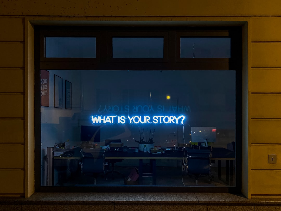
Black & White Aesthetics for Modern Creators: Using Monochrome to Strengthen Your Brand
Learn how monochrome branding cuts feed noise, boosts timelessness, and strengthens creator storytelling across every channel.
Black & White Aesthetics for Modern Creators: Using Monochrome to Strengthen Your Brand
Monochrome branding is not a gimmick; it is a strategic visual decision that can help creators cut through feed noise, signal intent, and make a brand feel more deliberate. In a content ecosystem crowded with gradients, neon overlays, and fast-changing trends, black-and-white visuals can read as confident, timeless, and editorial. François Ozon’s lustrous monochrome film style in The Stranger is a useful reference point: the absence of color does not make the image feel empty, it makes texture, light, shadow, and mood more legible. Creators who understand that principle can use minimalist aesthetics to improve audience perception across blogs, social posts, short-form video, and even product storytelling.
This guide breaks down how to use monochrome branding with purpose, not just style. You will learn when black and white strengthens content differentiation, how to build a visual identity around timeless visuals, and how to adapt film influence into practical creator workflows. If you are also refining your wider growth system, it helps to connect visual strategy with distribution strategy, like the tactics in our guide to conversational search for content discovery and the planning mindset behind data-backed trend forecasts.
Why Monochrome Still Cuts Through in a Color-Heavy Feed
Black and white reduces decision fatigue
Color-heavy feeds ask the audience to process saturation, palette, and brand cues in a split second. Monochrome simplifies that experience by removing one layer of visual noise, which makes the remaining elements feel more intentional. When the eye is not competing with a rainbow of competing colors, it locks onto composition, expression, typography, and contrast. That is why monochrome often feels premium even when it is technically simple.
This effect matters for creators because attention is increasingly fragmented. A black-and-white thumbnail can feel different enough to interrupt habitual scrolling, especially when most posts are visually similar. The strategy is not to look “old-fashioned”; it is to make the image feel editorial, cinematic, or reflective. If you are building a content system, treat monochrome as a deliberate signal in the same way product teams treat release notes in feature-change communication: clarity often converts better than novelty.
Minimalist aesthetics can elevate perceived value
Audiences often infer quality from restraint. In brand psychology, less visual clutter can imply more confidence, better taste, and stronger curation. This is why monochrome branding is so effective for creators selling expertise, taste, or transformation, whether that is in education, design, wellness, fashion, or commentary. A black-and-white palette does not automatically make content better, but it can make the viewer assume there is a point of view behind it.
You can see a similar “curation effect” in adjacent content strategies, like the editorial framing behind brand personality and mystique or the way a creator might package niche expertise into micro-niche Halls of Fame. The message is the same: when you choose fewer visual variables, your audience notices the ones you keep.
Monochrome creates an instant distinction cue
In crowded categories, differentiation is often less about being louder and more about being recognizable in one second. Monochrome can become that recognition cue. A creator who consistently uses black-and-white visuals for intros, quote cards, thumbnails, or editorial photography starts to own a visual lane. Over time, the audience no longer just recognizes the subject matter; they recognize the presentation.
That is especially valuable for creators trying to move from “another account in the feed” to a trusted media brand. The same logic underpins turning backlash into co-created content: distinctive framing creates conversation. If your visual style is coherent enough, it becomes part of the content itself.
The Psychology of Timeless Visuals
Why black and white feels durable
Timeless visuals work because they are less tied to a specific trend cycle. Color palettes can quickly anchor a post to a particular season, platform trend, or cultural moment, while monochrome often feels less time-bound. This gives creator content a longer shelf life, especially for evergreen topics like how-to guides, brand stories, interviews, and thought leadership. A post that looks “current” today but “dated” next month may still perform, but a timeless visual often performs for longer because it stays aesthetically acceptable.
This is one reason monochrome is so effective for signature series and repeatable formats. Think of it like a durable wardrobe choice: it stays relevant because it is built on classic structure rather than trend dependency. If you want to extend the life of each asset, pair monochrome design with strong evergreen topic selection, similar to the planning discipline in personalized AI content systems or the repeatable structure in script library patterns.
Film influence adds mood and narrative gravity
Ozon’s monochrome adaptation of The Stranger is a reminder that black and white can intensify mood by forcing the viewer to read light, texture, and gesture as narrative elements. For creators, film influence is valuable because it encourages stronger composition: more negative space, more intentional framing, and more control over visual rhythm. When your images feel cinematic, your audience often reads them as more meaningful, even before they read the caption.
That does not mean every creator should mimic art-house cinema. It means using film language—contrast, shadow, grain, stillness, and sequence—to reinforce your brand story. This approach works especially well for creators who want to feel reflective, expert, or artistic. For ideas on translating aesthetic choices into broader audience strategy, see real-world photo storytelling and how audiences interpret visual disguise.
Audience perception changes when visuals feel curated
People do not just see content; they infer meaning from it. Monochrome can suggest seriousness, restraint, or high craft, which may attract the exact audience you want if your niche values trust and perspective. It can also repel people who are looking for playful, high-energy visuals. That is not a flaw. Good branding should filter as well as attract.
If your goal is to build a distinct audience, then audience filtering is part of the strategy. The creators who win long-term are often the ones who make a clear promise about what their brand feels like. A similar mindset appears in responsible brand scaling through research and in trust-score thinking: clarity builds confidence, and confidence drives conversion.
When Monochrome Works Best Across Blogs, Social, and Video
Blog graphics and article featured images
On blogs, monochrome can make featured images feel more editorial and less promotional. That matters because a lot of creator content gets buried when every thumbnail looks like an ad. A strong black-and-white image with one or two focal points can anchor a long-form article and create a cohesive reading experience. If your blog aims to feel like a magazine rather than a sales page, monochrome is one of the fastest ways to signal that positioning.
It also supports content repurposing. A monochrome hero image can be cropped into social banners, embedded into newsletters, or reused in presentation slides without clashing with platform UI. If you are also balancing distribution and conversion, study how creators map content assets into systems, much like the operational approach in monetizing through platform shifts or interactive features at scale.
Instagram, TikTok, and short-form video hooks
In short-form channels, the first frame matters more than creators often realize. Black-and-white footage can make the opening shot feel more dramatic, especially if the topic is emotionally charged, reflective, or documentary-style. It can also make simple scenes feel more tactile: hands, paper, fabric, pavement, steam, and facial expressions all look richer when contrast is handled well. That is why monochrome is especially strong for behind-the-scenes clips, founder diaries, studio walks, and process videos.
The key is not to convert every frame into monochrome, but to use it as a signal. For example, use black-and-white for the hook, then transition to color if you want to show “before/after” or “past/present.” That contrast becomes a narrative device. This is the same type of visual logic behind maximalist art curation, except here the power comes from reduction rather than abundance.
Newsletter headers and launch creative
Monochrome is also useful in email because it can improve brand consistency without overpowering the message. A black-and-white header lets your subject line and offer take center stage while preserving a premium visual feel. For launches, monochrome works particularly well when you want urgency without shouting. It can make a product announcement feel more serious, more exclusive, or more thoughtfully produced.
For creators offering paid guides, memberships, or services, that sense of seriousness can support conversion. It aligns with the logic in premium research tool valuation and integration playbooks after acquisitions: people trust offers that look organized, not improvised.
How to Build a Monochrome Brand System Without Looking Flat
Define your tonal range
Monochrome does not mean one shade of gray. The strongest black-and-white brand systems use a full tonal range: deep blacks, clean whites, soft grays, and midtones that give depth. If everything is equally dark or equally light, the image can feel muddy or sterile. Good monochrome work depends on contrast management, not just desaturation. That is true whether you are shooting on a phone, editing in Lightroom, or designing templates in Figma.
Start by defining what your brand should feel like: stark, cinematic, editorial, calm, luxurious, or documentary. Then map that feeling to tonal preferences. A luxury brand may prefer soft highlights and controlled shadows, while a gritty street-style brand may prefer deep blacks and pronounced grain. Think of this like choosing product or packaging categories in style-led retail: the details carry the positioning.
Use texture, not color, as your variation layer
When you remove color, texture becomes the new differentiator. Materials like fabric, paper, concrete, glass, skin, smoke, metal, and ink all become more visible in monochrome. This is why black-and-white storytelling often feels more tactile. The audience can almost feel the surface of the image. Creators can use that to make simple subjects feel rich and intentional.
Practical example: a wellness creator could alternate between matte journal pages, reflective water, and soft shadows from window blinds. A food creator could show steam, ceramic bowls, knife marks, and steam trails instead of leaning on colorful ingredients. For more on creating emotional, atmosphere-driven content, compare this with wellness travel imagery and print-gallery curation for winter light.
Introduce one controlled accent when needed
Some of the most memorable monochrome systems are not pure black and white. They use one accent sparingly, such as a red icon, a gold line, or a skin-tone highlight in an otherwise desaturated frame. The point is not to break the aesthetic; it is to direct attention. Used properly, one accent can function like a spotlight.
That said, restraint matters. If every post introduces a new accent, the brand loses its own rules and becomes visually inconsistent. Use accent color only when it has a job: calls to action, series labels, or a recurring signature motif. This mirrors the discipline behind knowing when to save and when to splurge: consistency beats impulse.
Monochrome Storytelling Framework for Creators
Build a narrative arc, not just a look
Monochrome is most powerful when it supports a story. That story can be transformation, reflection, legacy, tension, or quiet confidence. Instead of asking, “Does this image look cool?” ask, “What does the absence of color say about this moment?” A brand with a strong narrative can use black and white to imply memory, truth, documentary realism, or emotional distance.
For example, a creator documenting a rebrand could begin with raw, monochrome behind-the-scenes footage, then reveal a sharper, more polished version of the same scenes. A coach could use black-and-white visuals for origin-story posts, then use color for client wins to show motion from past to present. If you are building a content arc that evolves over time, the structure is similar to internal opportunity storytelling or underdog narratives.
Use sequence to create meaning
One monochrome image can feel elegant. A sequence of monochrome images can feel cinematic. Use carousels, short video cuts, and editorial spreads to create a rhythm: wide shot, close-up, detail, face, environment, action. This keeps monochrome from feeling static. The viewer moves through the sequence and discovers the story rather than receiving a single polished object.
This sequencing approach is especially powerful for creators in education, fashion, design, and wellness. If you want your audience to retain more of what they see, make the sequence do narrative work. For example, a creator may pair a monochrome hook with a text-heavy carousel, then close with a practical takeaway. The same principle appears in AI-assisted content workflows and vendor selection frameworks: systems work best when each step has a distinct role.
Match the visual tone to the message
Not every message should be rendered in the same monochrome style. A reflective essay may need soft contrast and negative space. A product reveal may need crisp lighting and glossy highlights. A social commentary post may need documentary realism. The more precisely you match the visual tone to the message, the more believable your brand becomes.
That alignment builds trust. It tells your audience that the look is not an accident; it is part of the point. The same is true in analytics-heavy workflows like GA4 migration and customer-facing AI incident playbooks: strategy only works when the execution is precise.
Creative Direction: Production Tips for Better Black-and-White Content
Light your subject before you desaturate it
Great monochrome visuals begin with lighting, not with an editing preset. If the scene has poor light, black and white will not save it. In fact, desaturation often reveals flaws more clearly because it strips away color distractions. Prioritize shape, shadow, and separation between subject and background. Window light, side light, and hard directional light are especially effective for modern creator work.
On a practical level, shoot a test image in full color, then convert it to black and white while looking for contrast problems. If the face blends into the background or the product loses definition, adjust the scene before editing. This approach is similar to stress-testing decisions in risk-matrix planning or observability frameworks: diagnose before you polish.
Watch for skin tone, fabric, and shine
In monochrome, skin texture and fabric texture become more visible. That can be flattering, but it can also be unforgiving if lighting is harsh or the camera is too close. Creators should test how different materials behave: matte cotton, satin, leather, paper, glass, and metal each react differently. If your brand depends on elegance, your wardrobe and set design need to be monochrome-friendly too.
That is why fashion, jewelry, and styled product content often looks expensive in black and white. It reduces chromatic distraction and lets form dominate. The same logic applies to products with detail and craftsmanship, much like the presentation discipline in jewelry design craftsmanship and protective accessories.
Edit for consistency, not uniformity
A strong monochrome brand does not mean every image looks identical. It means the images share a recognizable family resemblance. Create a preset or style guide that defines contrast, grain, shadow depth, cropping, and text overlays, but allow room for variation in mood. Too much uniformity can make a feed look repetitive, while too much variation weakens recognition.
As a rule, aim for a stable visual language across three levels: composition, tonal range, and typography. If all three shift constantly, the audience cannot build memory around your brand. If you need a practical analog, think of the way AR previews influence tour selection or how smart home lighting creates consistent atmospheres: the environment shapes perception.
How Monochrome Helps Monetization and Audience Growth
Stronger brand recall improves conversion readiness
When your visuals are distinctive and consistent, people remember you more easily. That matters because monetization rarely happens on first touch; it usually happens after repeated exposure and familiarity. Monochrome branding can accelerate that recognition by making your posts feel connected even across platforms. The result is a stronger mental association between your content and your point of view.
Creators often underestimate how visual coherence supports sales. A visitor who recognizes your style may be more likely to subscribe, download, or buy because the brand already feels established. This is the same logic behind creator matchmaking for craft brands and micro-niche monetization: recognition shortens the trust-building process.
Timeless visuals make premium offers feel more premium
If you sell consulting, courses, memberships, templates, or high-touch services, your visual identity affects how people interpret your price. Monochrome can support a higher perceived value because it often resembles editorial, gallery, or luxury branding. That does not mean you should inflate prices based on design alone. It means your aesthetic can remove friction by making your offer feel more considered.
This is particularly useful for creators with limited budgets. You do not need a large production team to look intentional if you have a clear visual system. By leveraging simple, repeatable rules, you can make every asset feel premium. That mirrors the practical efficiency found in standardization playbooks and scaling without bottlenecks.
Aesthetic differentiation supports platform resilience
Algorithms change. Trends fade. What remains useful is a brand that people can identify quickly and trust consistently. Monochrome helps with that because it is less dependent on transient platform aesthetics. When your visual system is stable, you can adapt your format without losing your identity. That makes your content portfolio more resilient.
If you are also tracking platform risk, the creator economy increasingly rewards those who diversify formats and distribution. A strong visual identity can carry across newsletters, blogs, podcasts, carousels, reels, and long-form video. For broader market thinking on shifts and timing, see how regulatory shocks shape platform features and subscription price trend tracking.
Monochrome Brand Checklist and Practical Comparison
Choose the right monochrome approach for your goal
Not all black-and-white aesthetics serve the same purpose. Some are intended to feel raw and documentary, others refined and luxurious, and others clean and modern. The right approach depends on your content promise, audience expectations, and monetization goals. The table below compares common monochrome styles and how they perform for creators.
| Monochrome style | Best for | Audience perception | Strengths | Watch-outs |
|---|---|---|---|---|
| High-contrast black & white | Bold hooks, fashion, commentary | Decisive, dramatic, premium | Strong scroll-stopping power, clear subject separation | Can feel harsh if overused |
| Soft grayscale | Wellness, essays, reflective content | Calm, thoughtful, intimate | Gentle mood, timeless, easy to integrate in newsletters | May blend into the feed if lighting is weak |
| Film-grain monochrome | Storytelling, behind-the-scenes, brand documentaries | Cinematic, nostalgic, human | Adds texture and emotional depth | Too much grain can reduce clarity on mobile |
| Minimal studio monochrome | Product launches, tutorials, thought leadership | Clean, controlled, authoritative | Feels polished and professional, great for templates | Can look sterile without human detail |
| Mixed monochrome with accent | Series branding, CTAs, signature campaigns | Modern, strategic, memorable | Directs attention and builds brand memory | Accent misuse can break cohesion |
Use this table as a decision tool, not a style contest. The best monochrome system is the one that matches your content goals and your audience expectations. For a creator economy lens on planning and performance, it is useful to think like a recruiter or analyst: you are optimizing for fit, not aesthetics alone. That is why frameworks from data-driven recruitment and business intelligence are surprisingly relevant to content direction.
Monochrome brand audit checklist
Before you commit to a monochrome identity, audit your content with a simple yes/no checklist. Does your current visual system create recognition within three seconds? Does it work across square, vertical, and wide formats? Can you maintain it consistently with your current time and budget? If the answer to any of these is no, simplify before you scale. Visual systems fail most often when they are too ambitious for the creator’s actual workflow.
A practical creator audit should also review thumbnails, templates, captions, and CTA placement. Branding is not just the image; it is the full experience of encountering the image and moving through the content. If you need a broader framework for evaluating creative investments, borrow from insurance comparison logic and risk-versus-yield thinking.
FAQ: Monochrome Branding for Creators
Is monochrome branding too niche for a modern creator?
No. Monochrome is only niche if it is applied without a clear strategic purpose. When it is used as a consistent visual identity, it can actually broaden your brand’s appeal by making your content feel editorial, premium, or timeless. The key is matching the aesthetic to your niche and audience expectations.
Will black-and-white content hurt engagement on social media?
Not necessarily. Engagement depends more on relevance, clarity, and narrative than on color alone. Monochrome can improve performance if it makes the content stand out, sharpens emotional tone, or signals a unique brand position. The real question is whether your audience responds to your creative direction.
How do I keep monochrome from looking boring?
Focus on contrast, texture, framing, and sequencing. Black and white becomes boring when every image has the same light level, crop, and subject matter. Vary the visual rhythm and use different surfaces, shadows, and distances to create depth. A good monochrome feed still feels alive.
Should I convert everything to black and white?
Usually no. Many creators do better with a hybrid system: some monochrome for signature or story-driven content, and color for moments that benefit from warmth, energy, or product specificity. Using both can create contrast and prevent fatigue.
What tools should I use to build a monochrome workflow?
You can start with simple editing tools that let you control exposure, contrast, curves, and grain. The best workflow is the one you can repeat quickly. If you are building a scalable creator stack, consider how your tools support consistency the same way operational systems support repeatability in incident playbooks and AI-assisted content creation.
Conclusion: Make Monochrome a Brand Decision, Not Just an Edit
Black-and-white aesthetics are powerful because they do more than simplify an image. They shape audience perception, create a sense of timelessness, and make your content feel more deliberate in a crowded digital environment. Used well, monochrome branding can strengthen your visual identity, support thematic storytelling, and help your creator brand stand apart across blogs, social media, and video. It is not about removing color for style points; it is about choosing a visual language that supports recognition and trust.
If you want to make monochrome work, start small and systematize. Pick one content series, one thumbnail format, or one storytelling format and standardize the rules. Then measure whether it improves recognition, saves production time, and supports conversions. For further growth strategy, keep building your distribution intelligence with discovery optimization, trend forecasting, and creator-brand matching. A strong aesthetic is not the finish line; it is a leverage point.
Related Reading
- Understanding Brand Personality: What Investors Can Learn from Celebrities’ Mystique - Learn how mystique and consistency shape stronger audience trust.
- Curating Maximalism: How to Build a Pop-Forward Art Collection for Lifestyle Shoots - Explore the opposite of monochrome and when bold color wins.
- From Controversy to Collaboration: Turning Design Backlash into Co-Created Content - See how visual choices can become community conversation starters.
- Astronaut iPhone Moonshots and Game Marketing: Using Real-World Photos to Sell Fantastical Experiences - Use reality-based imagery to make imaginative stories feel credible.
- Brightening Your Print Gallery: Choosing Art that Shines in Winter - Get practical advice on light, display, and seasonal visual merchandising.
Related Topics
Jordan Hale
Senior SEO Content Strategist
Senior editor and content strategist. Writing about technology, design, and the future of digital media. Follow along for deep dives into the industry's moving parts.
Up Next
More stories handpicked for you

Adapting Classics Without the Backlash: What Content Creators Can Learn from Film Reworks

Navigating TikTok's Corporate Changes: What Creators Need to Know

Small & Flexible: Adopting Cold-Chain Lessons to Improve Creator Fulfillment

How Shipping Shocks Should Shape Your Creator Commerce Strategy

AI's Role in Transforming Account-Based Marketing: A Deep Dive
From Our Network
Trending stories across our publication group
From Hero to Villain: How Polarizing Sports Narratives Can Power Your Content Strategy

Automated Grading and Platform Moderation: Ethical Lessons Creators Can’t Ignore
Leveraging Weather Delays: How Creators Can Turn Adversity into Opportunity

Reframing Controversial Narratives: How Podcasters Should Navigate Colonial and Sensitive Source Material

Adapting Literary Classics for Audio: Balancing Faithfulness and Modern Relevance
